
+Jakarta
+ Visual Branding+ Art Direction
+ Communication Strategy
+ Social Media Strategy
When The City Calls, You Answer

The Provincial Government of Jakarta wanted to have a city rebranding that highlights the capital's identity and communicates its values. Something outside of the national tourism slogan that its inhabitants can relate to.
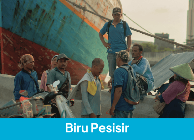
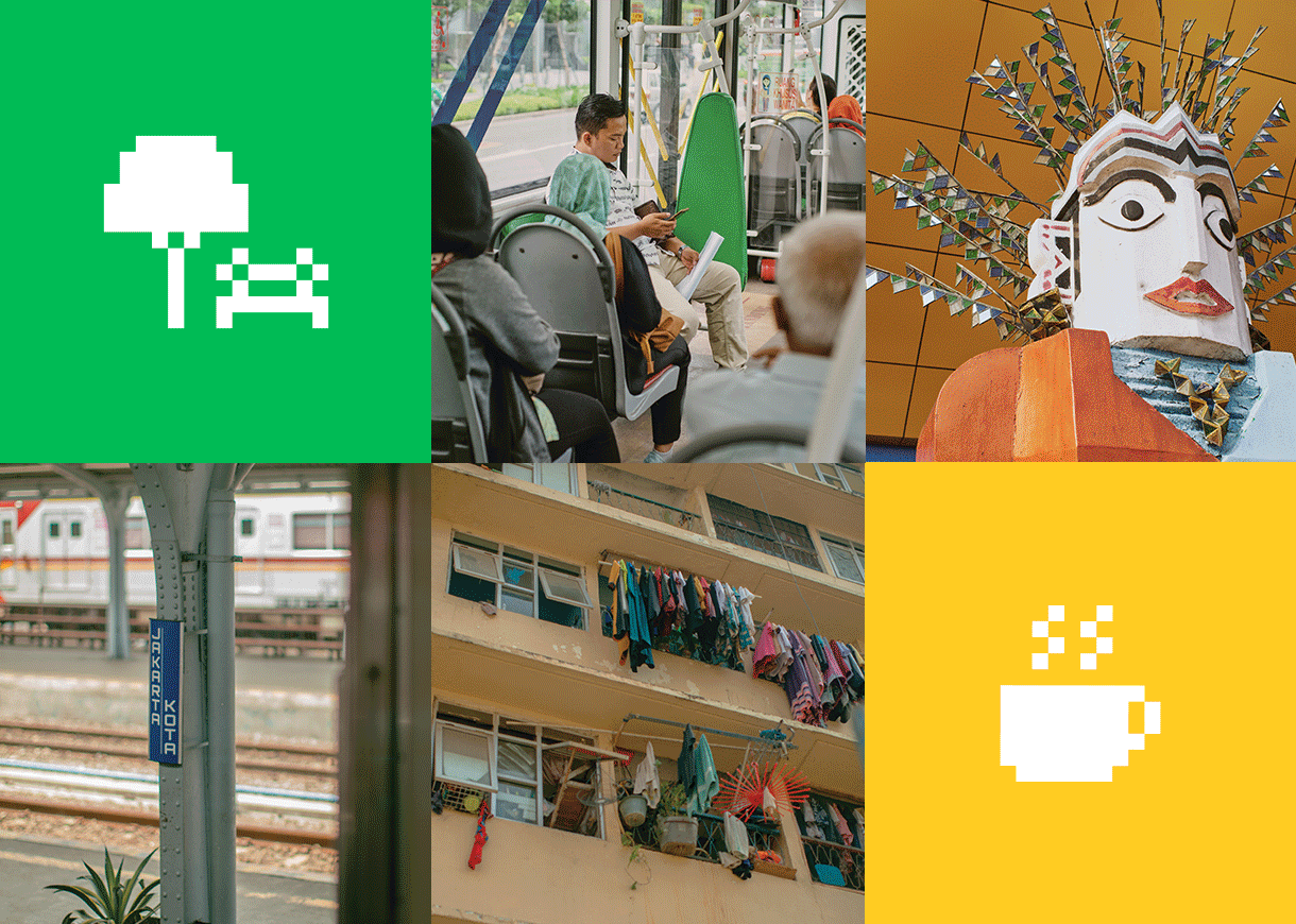
But what is exactly the identity of Jakarta? It’s a tough city, it’s crowded, it’s diverse, it’s vibrant, it’s competitive, it’s full of opportunities…the list goes on and on. So how do we put a fresh face to a city that can't be defined as one thing?
We quickly realized
that what the city needs
is not another face,
but active hands.
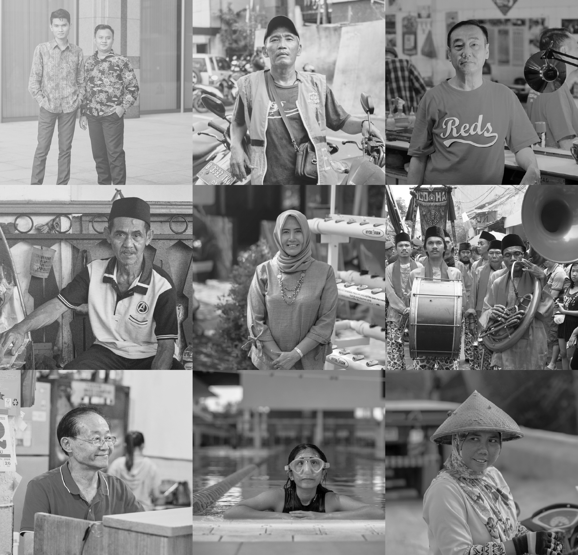
Thus, +Jakarta (read: Plus Jakarta) was born: a new approach to collaboration between the city and its inhabitants. It’s a catalyst for people to take actions, a bridge for an open, two-way communication and it’s also an invitation for stakeholders to get on board. It’s a way to support the government to facilitate its inhabitants in pursuing their dreams and aspirations. That together we can build a city we all want to live in.


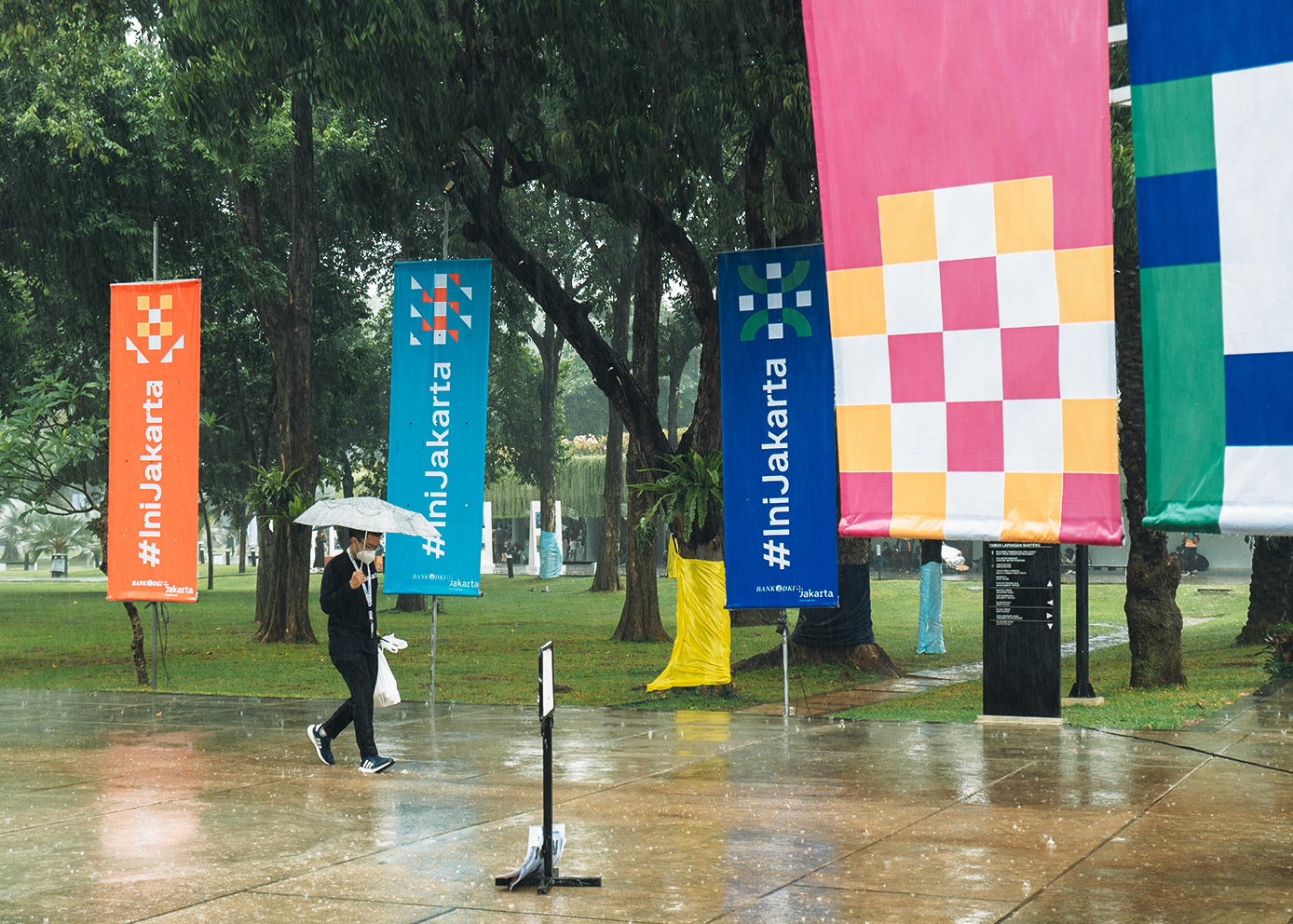
The key to communicating a new identity is in the details. Much like Jakarta’s diverse areas and cultures, the '+' sign represents the six municipalities of Jakarta: North, South, Center, West, East and Pulau Seribu. It’s all written using the typography of 'Plus Jakarta Sans', where each letter has its own variation from a more round shape to a sharp one.
The color used is part of the 'Menor' family, reflecting the contrast and quirky combination of bright colors we see everywhere in the city of Jakarta while the other visual elements create a pattern system that dances wherever the city goes. All these details combined represent a new identity that, much like the city, is striking and resounding.

| For | Year | Services | Team |
|---|---|---|---|
| +Jakarta | 2020 | Visual Branding, Art Direction, Communication Strategy, Social Media Strategy | Grace Patricia Irfansyah Aryabima Sharein Shafa Kevin Arffandy Frances Cherry Donna Josefa Agrita Widiasari Shafira Sahara Indy Wibowo Teddy Koentjoro Nindita Kirana Prabowo Prajogio |
© 2024 - 6616